Overview
The Retail Consumption Dashboard is designed to provide multiple views of a Provisioning Entity’s usage over time. It focuses on presenting usage rated based on Azure Retail Pay-As-You-Go charges minus any Retail Discount defined for the affected Nebula Organizations.
When first loaded, the dashboard will present all usage data for all of the selected months that you chose when the report was generated as described in How to Generate an Analysis Report. It will include data either from the Provisioning Entity you are currently selected to use or, if you clicked the checkbox for “all Provisioning Entities”, it will include data from all Provisioning Entities to which you have access. The choices you make in the Generation of the Analysis determine the usage data made available to the views in the Dashboard.
Once generated, the dashboard is made up of seven different views that can be navigated using the navigation bar at the top of the screen:

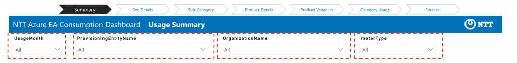
Each different view within the dashboard provides a series of filters to narrow the presented data down to a specific Usage Month, Provisioning Entity, Organization, etc. For example, the Summary dashboard allows you to filter the view by Usage Month, Provisioning Entity, Organization, and type of Azure Meter (PAYG, RI, MARKETPLACE, SPOT). Simply pull down the filter and make selections your report view will updated to the filtered usage.
Note that when dashboards are run against multiple Provisioning Entities, the filters become more important to use as you’re viewing data across multiple separate Entities! Users must be particularly cognizant of avoiding combining the data from Provisioning Entities using different currencies.
In addition to the filters, the views themselves are interactive. If you click on elements within the view, other aspects of the view will update to filter the view to what you’ve selected.
The following sections provide an overview of the purpose of each of the seven views. Note that all of these views rely on the same underlying dataset described in Details on Monthly Costs Analysis Data Set. See that article for further details on the underlying data.
Overview of Each Retail Consumption View
SUMMARY VIEW
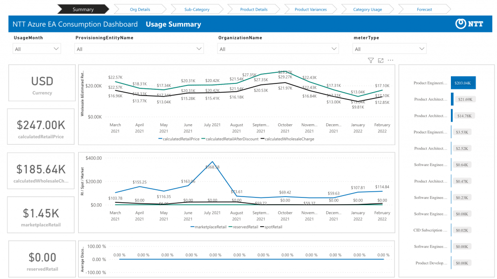
The left-hand side of the Summary View provides summary totals of calculatedRetailPrice and calculatedWholesalePrice for the Azure usage. Remember those totals are for the entire period of usage data you’ve loaded, filtered to any months you’ve chosen in the filter.
The center of the dashboard view provides a trend analysis over time based on the selected data.
On the right hand column, the data is summarized by Organization. Note that in addition to the filters, you can click on an Organization on the right-hand side to update your view to highlight data for the specific organization.
ORG DETAILS VIEW
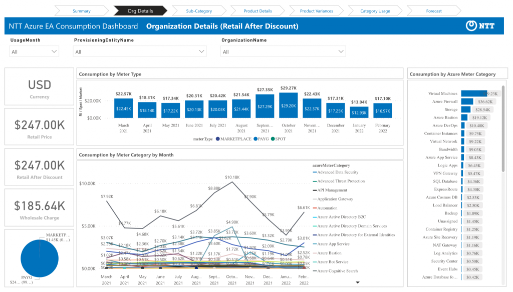
The Org Details View provides access to the same data but presents a breakdown based on the Meter Type (PAYG, RI, MARKETPLACE, SPOT) and the Azure Meter Category. The right side provides the same ability to instantly update the view based on Meter Category.
As you might guess from the naming, this view is best suited to viewing data for a specific Organization (or a small number of related ones) using the Organization Name filter at the top of the view. It allows you to identify the high-level categories and amounts of Azure Retail Pay-As-You-Go charges minus any Retail Discount being incurred by an organization. A reminder that these are not the Wholesale costs incurred to your Provisioning Entity.
SUB-CATEGORY VIEW
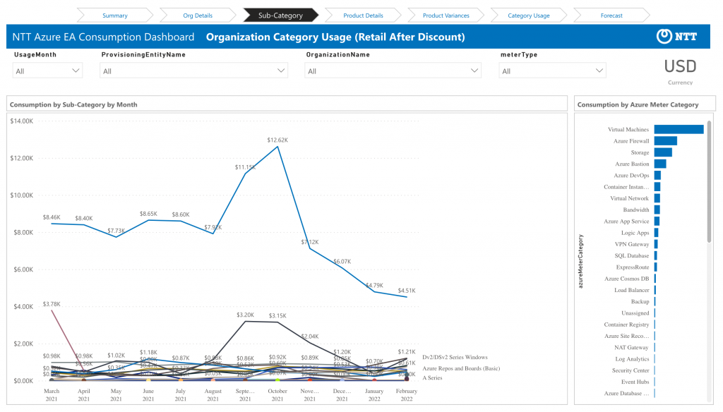
The Sub-Category View goes a level deeper to present the trend data based on the Azure Meter Sub-Category, one level deeper than Azure Meter Category. Again, all “spend” data here is based on Azure Retail Pay-As-You-Go charges minus any Retail Discount.
This view works best if you filter the view by an Azure Meter Category to see a more granular breakdown. For example, if I click on the “Storage” Meter Category on the right-side the view above, I get a breakdown of what type of Storage is generating the usage:
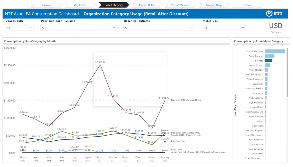
However, note that Azure does not publish Sub-Categories for all types of Azure Meters and Marketplace usage is not categorized at all, so the utility of this view may vary.
PRODUCT DETAILS VIEW
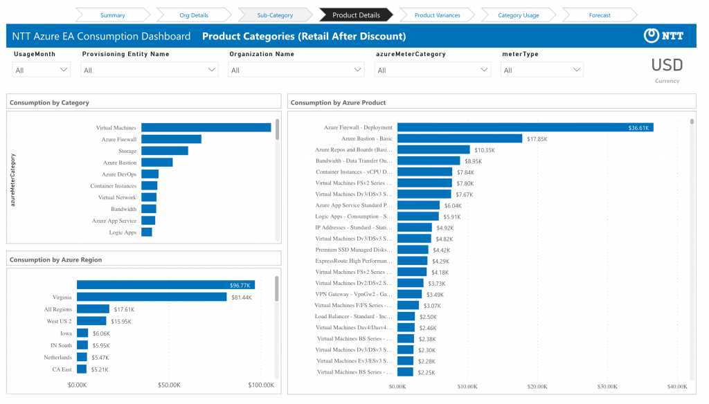
The Product Details view summarizes the filtered usage into sub-totals based on the Azure Category, Azure Product, and Azure Region. Again, all “spend” data here is based on Azure Retail Pay-As-You-Go charges minus any Retail Discount. The same caveats about which Azure Meters support this data apply. In particular, note that Azure Region is only populated for a subset of meters, so the “Consumption by Azure Region” will usually show a blank total (see above, above “Virginia”) unless you filter out those meters.
Again, clicking on entries within any of these categorizations will update the view to correspond to what you’ve filtered.
PRODUCT VARIANCES VIEW
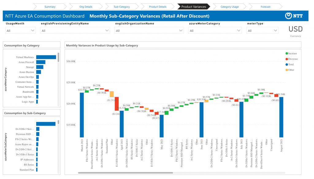
The Product Variances view is designed to identify what Azure Category of usage may be driving usage changes from month to month. Each month is presented with the full total of Azure Retail Pay-As-You-Go charges minus any Retail Discount as a blue bar. That blue bar is followed by the variances as to what categories see increases and decreases of these discounted retail charges in the following month.
Make sure to note that unless you’ve only chosen to view 2-3 months of data, you will need scroll this view to the right to see all of the information!
CATEGORY USAGE VIEW
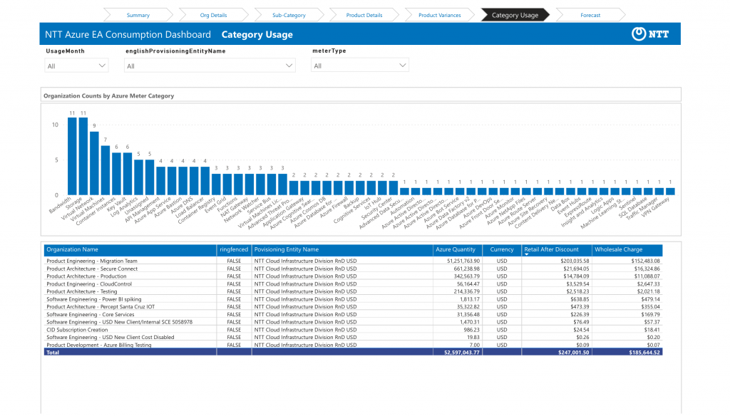
The Category Usage view presents a different type of analysis that allows you to identify what categories of Azure are being used by different Organizations in your Provisioning Entities. Rather than focusing on retail spend, this view is designed to identify the number of Nebula Organizations using a given Azure Category. So in the example above, I’m viewing a Provisioning Entity with 18 Organizations. All of them are using Bandwidth and Storage, but only a subset are using other categories. If I click on the “Service Bus” meter category from the graph, I can identify the details and spend of the five organizations using Azure services in that category:
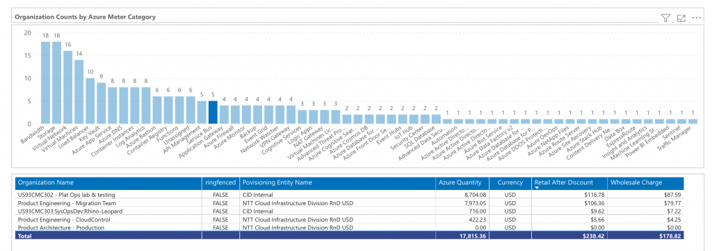
It is important to remember these totals are based on all usage months of data that you’ve loaded and to which you’ve filtered the view. If the category was used even briefly within any month of the view, it will be counted. Similarly, the Retail after Discount and Wholesale totals will include all usage from all months… so if you’re looking at a six month view and one Organization used the category the entire six month period and another just started using it in the last month, the totals shown will represent the charges over different period. If you want to compare relative spends, you should use the month filter to filter the data.
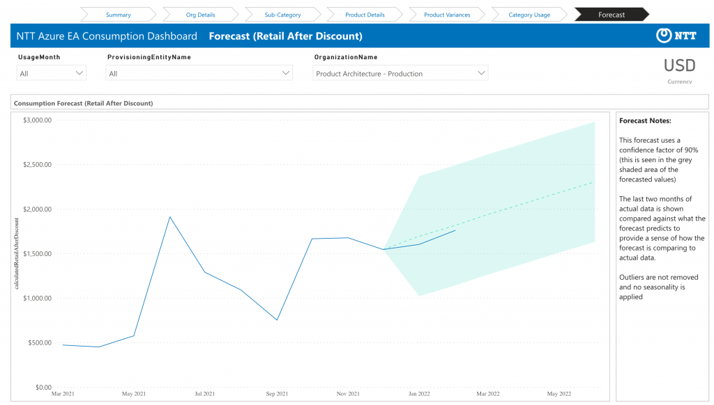
FORECAST VIEW
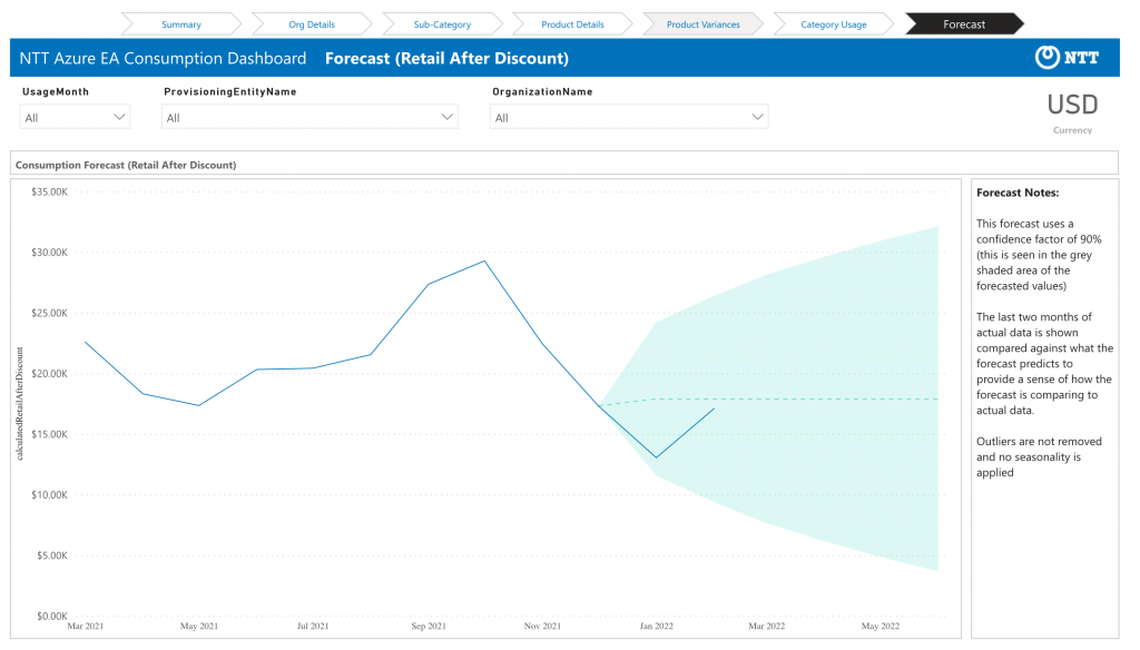
The Forecast view uses Microsoft’s PowerBI forecasting function to forecast Retail After Discount for future calendar months based on the historical data to which you’ve filtered. This function is likely to be effective mostly when filtered to a specific set of Organizations with enough historical data with a consistent history in order to make a projection.
In the example above, I’m looking at data for all Organizations in a scenario where Organizations have been added and removed over time. Given the confidence factor, the spread of possible future values is quite wide. Filtered down to a specific Organization (even one whose usage has varied up and down), I get a more targeted and useful view: